Abhinay Omkar
Redesign of Boarding Pass - Keep it Simple
I like travelling. I don’t get chance to travel a lot though.
Morning 26th Dec, I was returning to Bangalore (India) from my hometown — Hyderabad (India) after christmas holidays. Early morning flights are such bizarre, as soon as I got the boarding pass from the Airline counter I was rushing to reach the respective gate. I once mistaken the gate number with seat number (silly me!) which has same pattern as actual gate number at the Airport terminal.
When I first glanced at the boarding pass my eyes quickly pointed to seat number “30C” which is very clearly visible on first look with larger font size. But, the seat number is actually not required till the passenger on-boards the flight. What I actually needed at this rushy moment was the gate number.
Here is my approach on redesigning the IndiGo Airline’s boarding pass. This is also applicable to other Airlines which has messy boarding pass designs (No Offence) :D
Ok, enough of drama. Actual post starts from here.
My design philosophy is giving importance to real content and “Keep it simple”.
When it comes to reading data, human eye scans from top to bottom. Having many columns (left-to-right) actually takes little longer time to read and is confusing on first look than top-to-bottom.
In my design, I had placed all the labels on top of each block in the same column which is more accessible to read than having the label on left side.
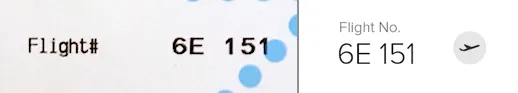
As pointed by adam glynn-finnegan in his blog post, information in boarding pass should follow chronological order where flight number followed by gate number followed by seat number.
Also, icon graphics are used to guide the human eye. It becomes lot easier when visuals are used.
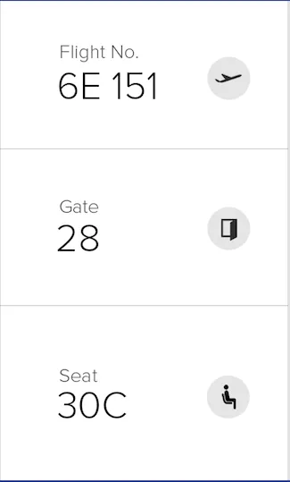
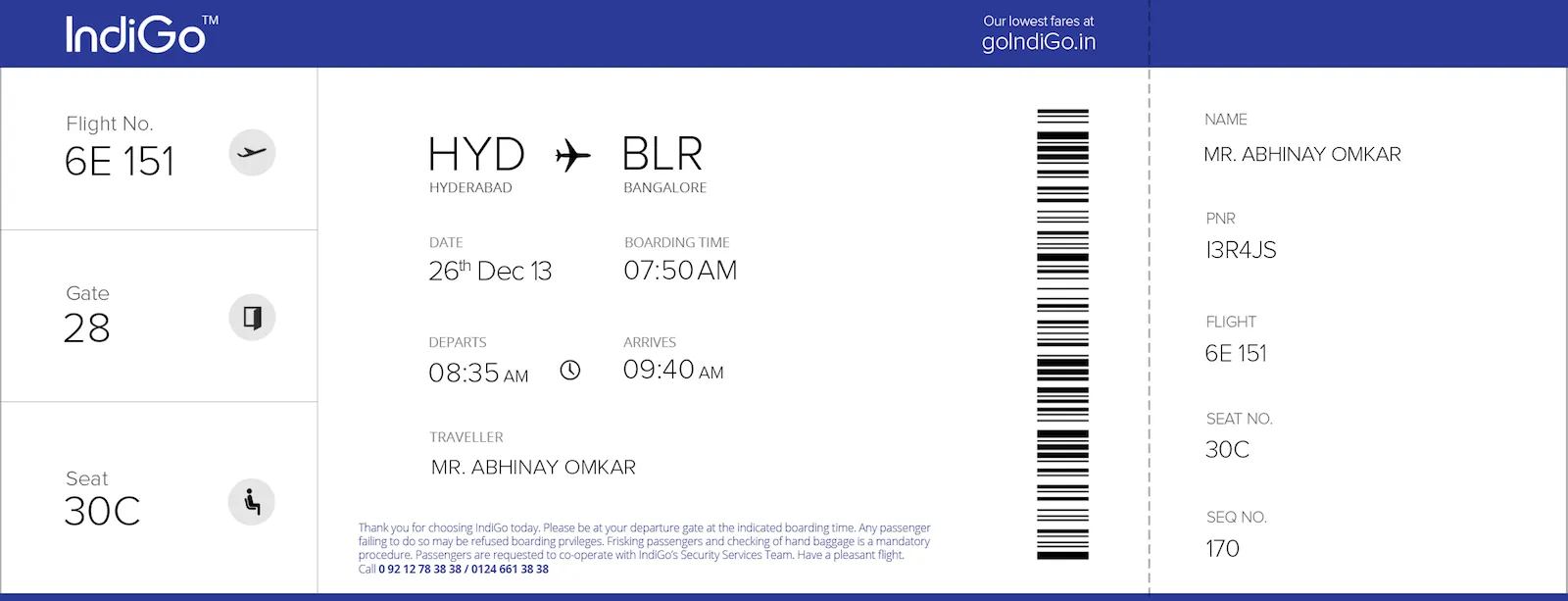
Here is my complete redesign for IndiGo Airline’s boarding pass: (Please click on the below image to enlarge)
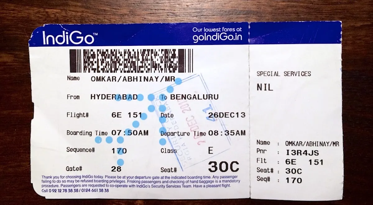
IndiGo’s original boarding pass:
Hope Airlines consider redesigning the boarding passes which is more appealing and more intuitive.
“Keep it Simple.”
Please drop in your comments for any suggestions.
You should follow me on Twitter — @abhiomkar
Ta
Update (December 30, 2013)
Response from IndiGo Airlines
Blog
- 8th year at Google April 16, 2024
- Why I chose Astro for my site December 17, 2023
- Atomic Habits book summary December 30, 2022
- Keto Diet with South Indian dishes December 23, 2020
- Redesign of Boarding Pass - Keep it Simple December 30, 2013
- How I used Dropbox to store my website content August 11, 2013